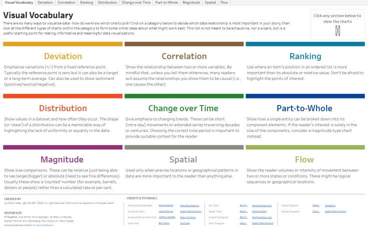
The Visual Vocabulary by the FT & Andy Kriebel
There are many ways to visualise data, but which works best? Andy Kriebel's Visual Vocabulary can help you decide.

A few of years ago the Financial Times published a chart called the FT Visual Vocabulary Guide. The idea behind it is fairly simple. There are lots of different ways to visualise data but which one is the best? The answer to that question is, of course, "It depends" 😊. However there are some guidelines that can help, depending on what type of data you are trying to visualise, ansd what you are trying to show. The chart droups visualisations by type such as Ranking, Distribution, Change Over Time etc., and shows you which chart types work best for those. It's a very useful resource.
The Visual Vocabulary by Andy Kriebel
Andy Kriebel took this a step further for the Tableau world, and created a Dashboard that shows them all in Tableau.
It's not downloadable because Andy was having problems with people downloading the workbook and then claiming they had created it. I don't why people do this, you will get caught if you do, especially in a community as tight knit as the Tableau one. But if you really want to see under the hood, message Andy and ask him if you can have a copy of the workbook, he might be feeling generous. I have a copy and I find it very useful, but it was given to me on the basis that I do not re-distribute it, so I don't. So please don't ask me, ask Andy - it's his work.

"Honesty is the first chapter in the book of wisdom."
Thomas Jefferson

